
Multicolumn Section Documentation
The Multicolumn section displays a row of content columns, each with an optional image, title, body text, and link. It is commonly used to showcase features, benefits, team members, testimonials, or any content that benefits from a uniform grid layout. The number of columns is fully configurable on both desktop and mobile.

Features
Flexible Column Count: Display 1 to 6 columns on desktop and 1 or 2 columns on mobile.
Per-Column Content: Each column independently supports an image, heading, rich text body, and an animated arrow link.
Consistent Image Sizing: Images across all columns are normalised to the same height using the tallest image's aspect ratio, ensuring a clean, even grid.
Image Shape Options: Choose from adapt, portrait, square, or circle image crops applied uniformly across all columns.
Image Width Control: Set images to take up a third, half, or the full width of their column.
Column Background Style: Optionally apply a card-style background to each column.
Column Alignment: Align all column content to the left or center.
Section Button: An optional primary call-to-action button displayed below the grid.
Mobile Swipe Slider: When enabled, columns that overflow the mobile grid become a swipeable carousel with prev/next controls and a counter.
Scroll Animations: Columns animate in with a cascading slide-in effect if animations are enabled in Theme Settings.
Settings
Heading
Settings
Description
Default
Heading
An optional section title displayed above the columns. Supports inline rich text (bold, italic, links). Leave blank to hide.
"Multicolumn"
Heading size
Controls the visual size of the section heading. Options: Small (h2), Medium (h1), Large (h0), Extra Large (hxl), Extra Extra Large (hxxl).
Medium (h1)

Image
Settings
Description
Default
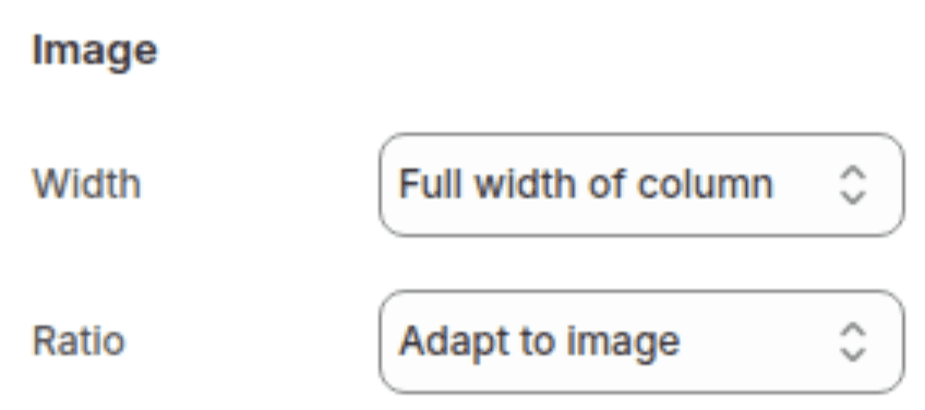
Image width
Sets how wide images are within each column. Options: One third (1/3 of column width), One half (1/2 of column width), Full width (fills the full column width).
Full width
Image ratio
Sets the crop shape applied to all column images. Options: Adapt to image (uses the tallest image's ratio across all columns), Portrait, Square, Circle.
Adapt to image
Button
Settings
Description
Default
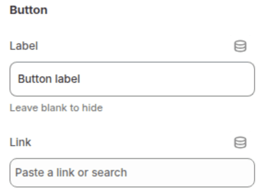
Button label
The visible text of the section-level call-to-action button displayed below the grid. Leave blank to hide the button. On mobile with swipe enabled, this also appears as an inline link next to the heading.
"Button label"
Button link
The URL the section button links to.
(empty)
Layout
Settings
Description
Default
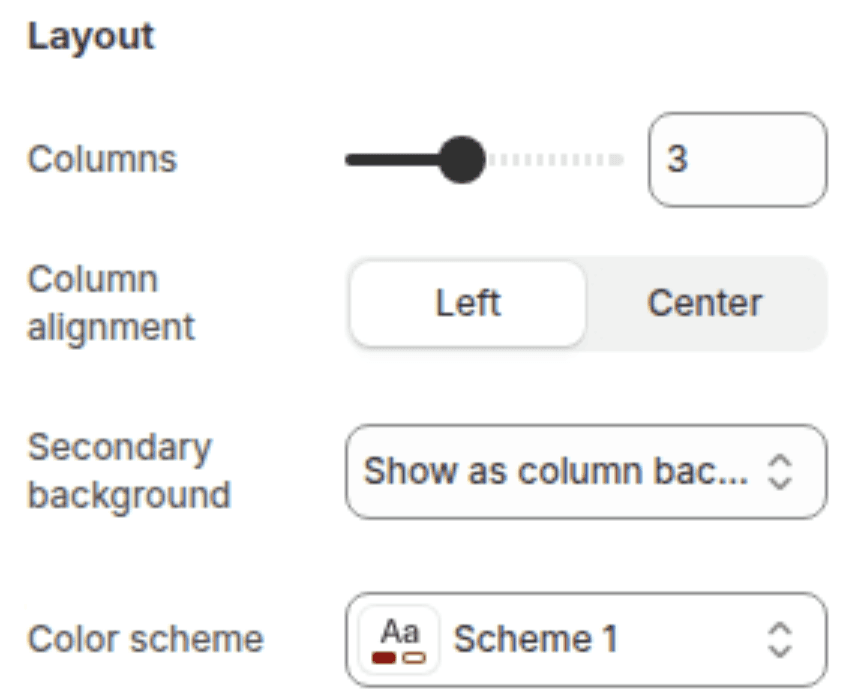
Number of columns on desktop
Sets how many columns display per row on desktop. Range: 1 – 6.
3
Column alignment
Sets the horizontal alignment of content (image, title, text, link) within each column. Options: Left, Center.
Left
Column background
Controls whether each column has a filled background applied. Options: None (no background), Primary (applies a filled card background using the section's color scheme).
Primary
Color scheme
Sets the background color of the section and, when column background is set to Primary, the color of each column card.
Scheme 1
Mobile
Settings
Description
Default
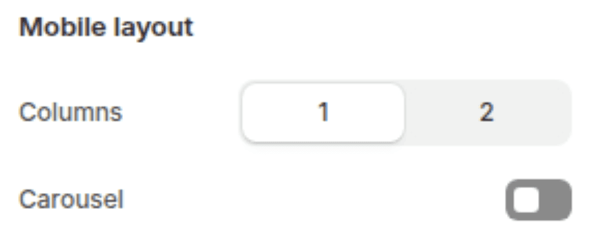
Columns on mobile
Sets how many columns display per row on mobile. Options: 1, 2.
1
Enable swipe on mobile
When enabled and the number of blocks exceeds the mobile column count, the section becomes a swipeable slider on mobile with previous/next arrow buttons and a slide counter.
Disabled
Spacing
Settings
Description
Default
Padding top
Sets the top padding of the section (0px – 100px).
36px
Padding bottom
Sets the bottom padding of the section (0px – 100px).
36px

Blocks
The section supports one block type: Column. There is no enforced block limit, so you can add as many columns as needed.
Column Block
Each column block represents one item in the grid.
Settings
TYPE
Description
Default
Image
Image picker
An optional image displayed at the top of the column. Leave blank for a text-only column.
(empty)
Title
Inline rich text
The column heading. Supports bold, italic, and links. Leave blank to hide.
"Column"
Text
Rich text
The body text of the column. Supports full rich text formatting (paragraphs, bold, italic, lists, links). Leave blank to hide.
"Pair text with an image to focus on your chosen product..."
Link label
Text
The visible text of an animated arrow link displayed below the body text. Leave blank to hide the link.
(empty)
Link URL
URL
The URL the column link navigates to.
(empty)

Customization Tips
Image Height Normalisation: When using Adapt to image ratio, all column images are set to the same height based on the tallest image across all blocks. Upload images with similar proportions to avoid excessive whitespace beneath shorter images.
Circle Ratio: Selecting Circle crops all images into circles regardless of their original proportions. This works best with square source images — portrait or landscape images will be cropped from the center, which may cut off important content.
Image Width — One Third / One Half: Setting image width to One third or One half switches the layout from stacked (image above text) to inline (image beside text). This is useful for icon-style layouts where a small icon sits alongside descriptive text in the same row.
Column Background — None vs. Primary: When set to None, columns have no visible background and the content sits directly on the section background. When set to Primary, each column gets a distinct filled card. If the section color scheme and the card background are the same color, the Primary setting will have no visible effect.
Swipe on Mobile and the Button Label: When swipe on mobile is enabled and a button label is set, the button label appears as an inline underlined link next to the section heading on mobile instead of as a full button below the grid. The full button below the grid is hidden on mobile in swipe mode. On desktop, the full button always shows regardless of the swipe setting.
Desktop Columns and Readability: Setting 5 or 6 columns on desktop can make each column very narrow. This works well for icon-only or minimal-text columns but can make longer body text hard to read. For text-heavy columns, 3 or 4 is typically the most comfortable maximum.
Empty Columns: A column block where all fields (image, title, text, link label) are left blank renders as an empty visible spacer in the grid. This is occasionally used intentionally for offset layouts but is most often unintentional — always check all blocks have content before publishing.